reBranding
Categories
Branding & Strategy
Client
Whisk n Wok
Project
Whisk n Wok
Services
Branding Art & Design Direction Strategy Packaging
Year
2025
Whisk n Wok by The Sewing Chef is home-based studio dedicated to the art of the unexpected. Specializing in unique artisanal delights and signature savory creations, we blend technical precision with soulful flavors to bring you handcrafted treats that are as intricate as they are delicious.
Their previous Brand identity lacked a modern design and failed to convey the nature of their product, leading to low conversions.
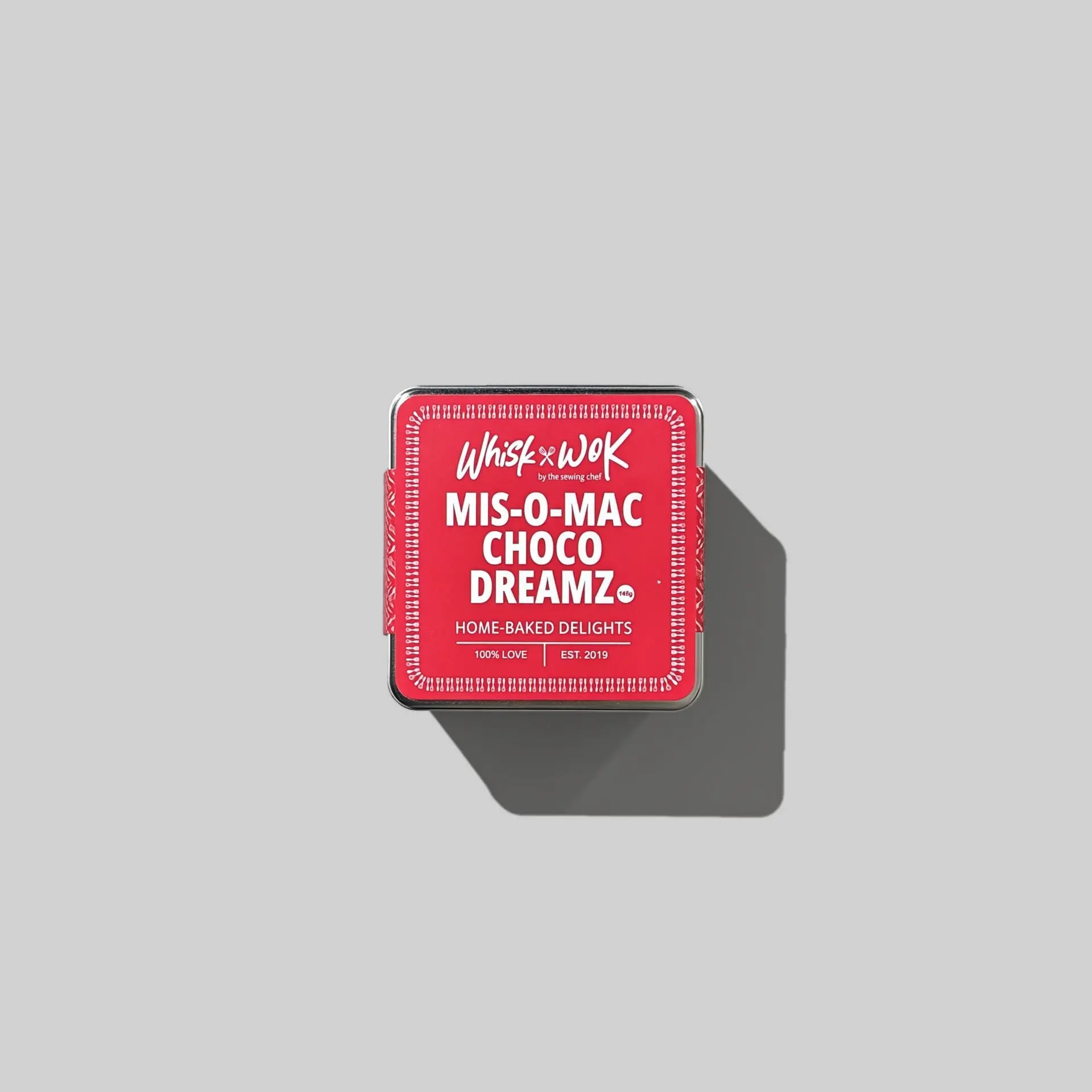
The handwritten font selected for the Whisk & Wok by The Sewing Chef logo is an intentional choice that captures the essence of the brand-personal, heartfelt, and handcrafted.
This style mirrors the brand's core values of warmth, care, and authenticity. Just as each baked treat and stitched creation is made with love and attention to detail, the handwritten typography brings a human touch that evokes a sense of sincerity and connection.
The fluid, organic strokes reflect the artisanal nature of the business, reminding us that behind every cookie, cake, or custom creation is a passionate individual pouring heart into her craft. It feels intimate, welcoming, and rooted in the story of a mother, maker, and chef.
This font choice is not just aesthetic - it serves as a visual extension of the brand's voice: genuine, nurturing, and made with love.
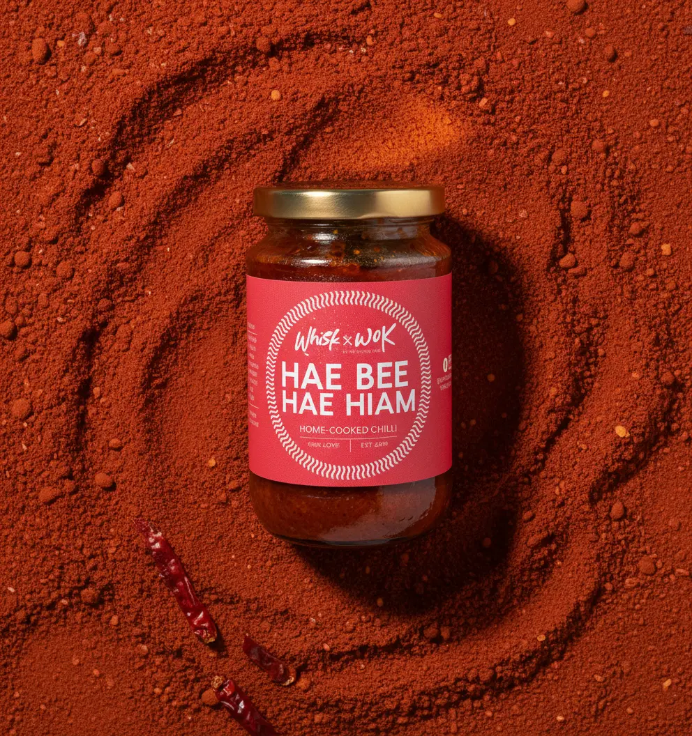
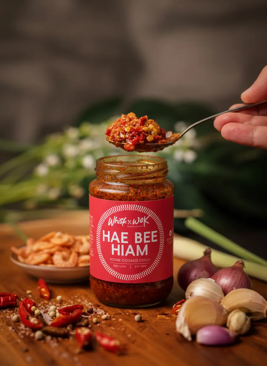
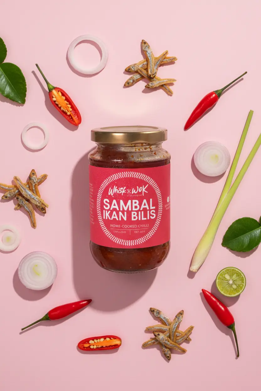
The refreshed identity for Whisk & Wok drove a 50% uplift in orders and significantly improved brand recognition. The packaging design was well received, earning positive customer feedback for its distinctive and thoughtful execution.
Whisk n Wok by The Sewing Chef is home-based studio dedicated to the art of the unexpected. Specializing in unique artisanal delights and signature savory creations, we blend technical precision with soulful flavors to bring you handcrafted treats that are as intricate as they are delicious.
Their previous Brand identity lacked a modern design and failed to convey the nature of their product, leading to low conversions.
The handwritten font selected for the Whisk & Wok by The Sewing Chef logo is an intentional choice that captures the essence of the brand-personal, heartfelt, and handcrafted.
This style mirrors the brand's core values of warmth, care, and authenticity. Just as each baked treat and stitched creation is made with love and attention to detail, the handwritten typography brings a human touch that evokes a sense of sincerity and connection.
The fluid, organic strokes reflect the artisanal nature of the business, reminding us that behind every cookie, cake, or custom creation is a passionate individual pouring heart into her craft. It feels intimate, welcoming, and rooted in the story of a mother, maker, and chef.
This font choice is not just aesthetic - it serves as a visual extension of the brand's voice: genuine, nurturing, and made with love.
The refreshed identity for Whisk & Wok drove a 50% uplift in orders and significantly improved brand recognition. The packaging design was well received, earning positive customer feedback for its distinctive and thoughtful execution.